There are over a hundred Wagner Societies in operation today, each responsible for festivals, lectures, and concert events dedicated to the eponymous composer. However, like much of classical art, Wagner Societies find themselves susceptible to graying trends; the pageantry of their programming simply does not appeal to Gen Z audiences. Wagner’s Nightmare, an art project of two young professional musicians stands to reverse this trend with its dramatic brand appeal.
Designing a rockstar project for classical music.
Wagner's Nightmare
Refining A Peculiar Market Position
When approaching a new brand partner, we look to time-tested psychological concepts to explain the modern consumer experience. Carl Jung posited twelve archetypes that lie at the heart of man’s storytelling. Each archetype represents a metaphysical presence in the human psyche; we are physically and spiritually primed to understand them and sense them in our environment. The power of brand is a modern expression of Jung’s works: with just a small amount of art and copy, consumers can construct a backstory, attitude, and POV.
Consumers understand vibe. The vibes for many classical art institutions are simply off.
Consumers cannot readily identify a cohesive personality in many institutional brands, even when they honor contentious historical figures like Wagner. By reducing their communications to corporate niceties, the personality, and thus the attractiveness to consumers disappears. When it comes to brand, playing it safe is almost always a danger.
Creating a Classical Rockstar
Our research showed that amplifying Wagner’s Nightmare’s humor, digital-first attitude, and irreverence would force it into the whitespace that Gen Z and Millennial audiences crave. While many arts groups reflexively select the Creator, we saw that adding the Jester and the Outlaw as complementary archetypes highlight the personality missing from many similar initiatives. Together, we call this composite archetype the Rockstar.
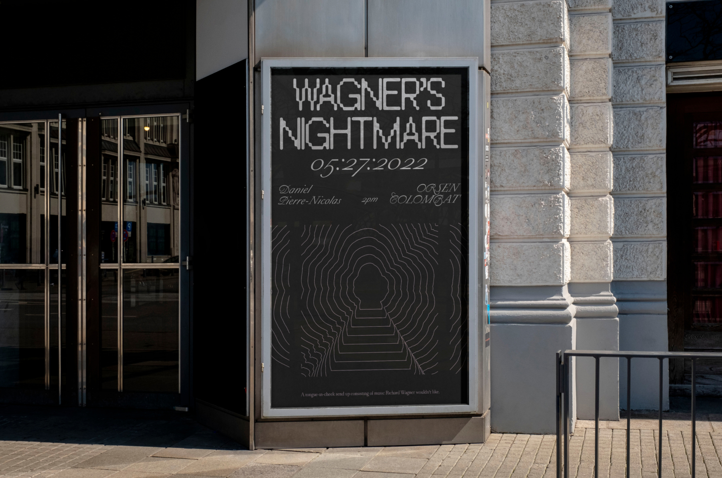
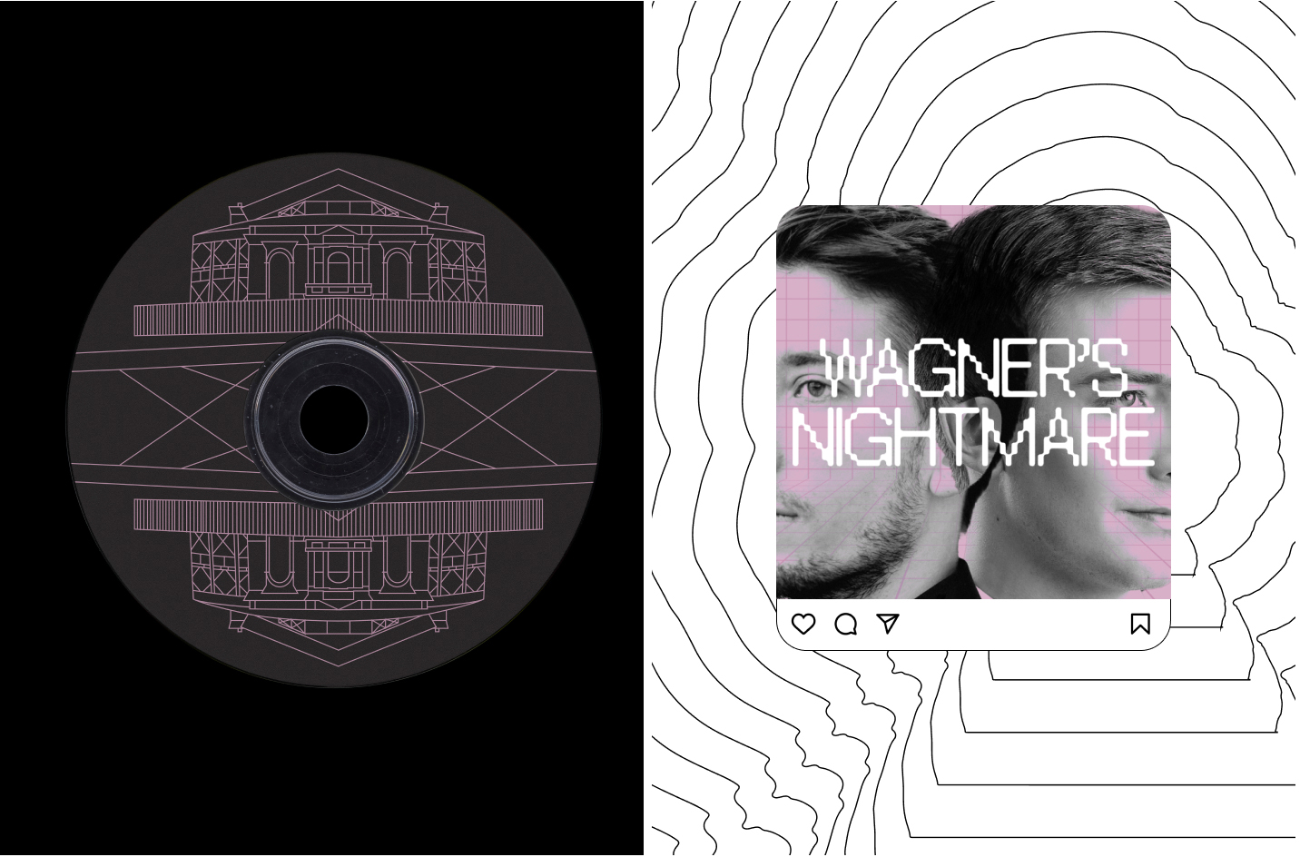
In the words of Colombat and Orsen, the two musicians and ideators of the project, Wagner's Nightmare is "music that Wagner would hate". That's the heart and soul of the project, and that's what we have built on going into the design phase: if Wagner would hate the music, he should hate the graphic identity, too. We took inspiration from the European clubbing scene and its posters, as well as from op-art and the graphic experiments of iconic designers such as Franco Grignani, to incept the seeds of a visual language that feels psychedelic, nightmarish, appropriating Wagner's beloved pink but plunging it in a field of black —the night, the subconscious— where it flashes as an accent color, conveying a sense of eerines and disquiet rather than the sophisticated eccentricity that it signified to Wagner.
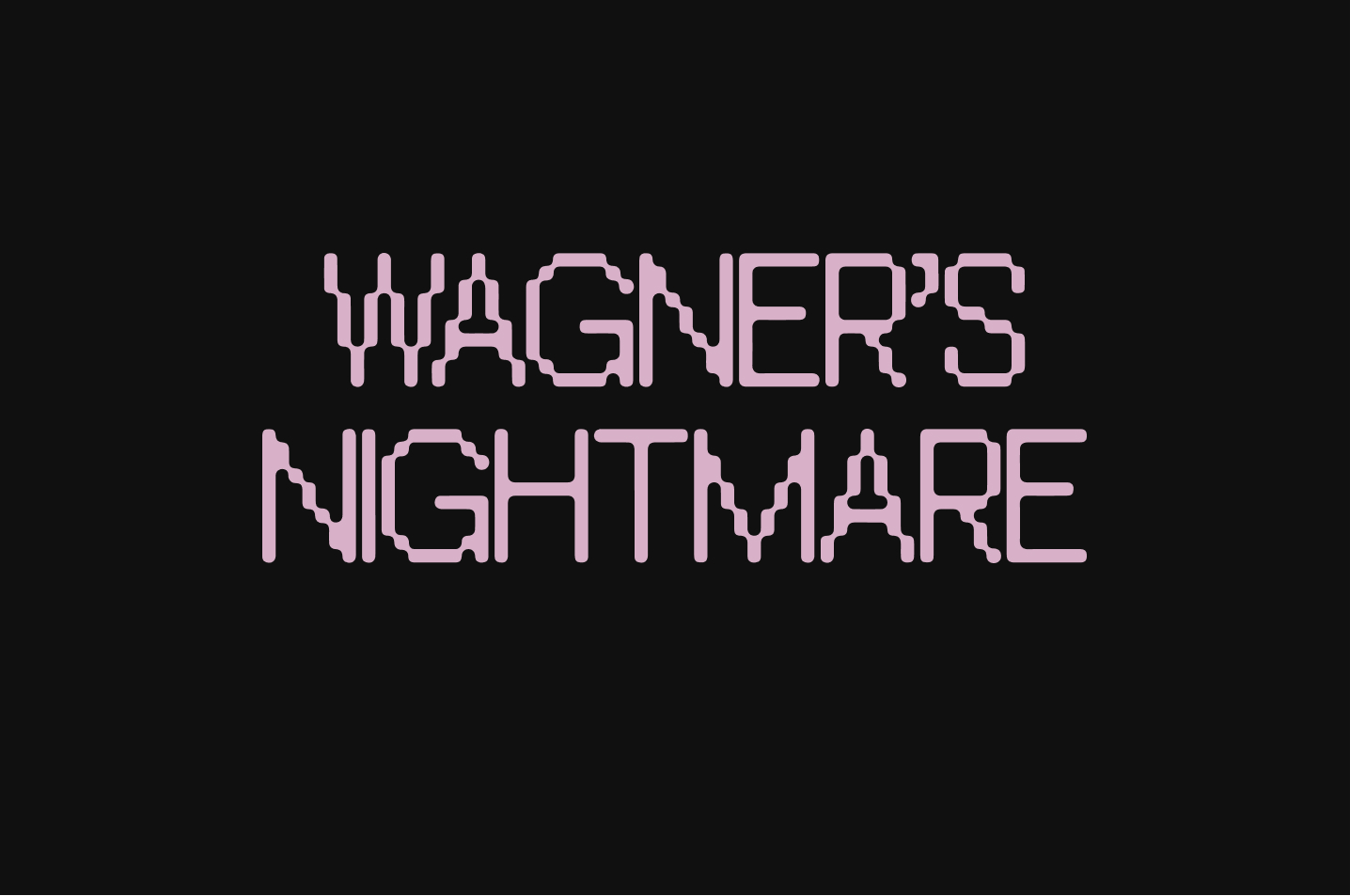
The project logo itself is rendered in a typeface that is reminiscent of pixelation, or arcade video games—glitches and instability are ever present, if only subtly suggested. All these motifs are further enhanced by the propagating patterns of lines and shape, now emanating from the center, now breaking down horizontally or vertically, that have served as the initial visual centerpiece for individual applications.