A landmark website for New York’s critics of high culture.

The New Criterion

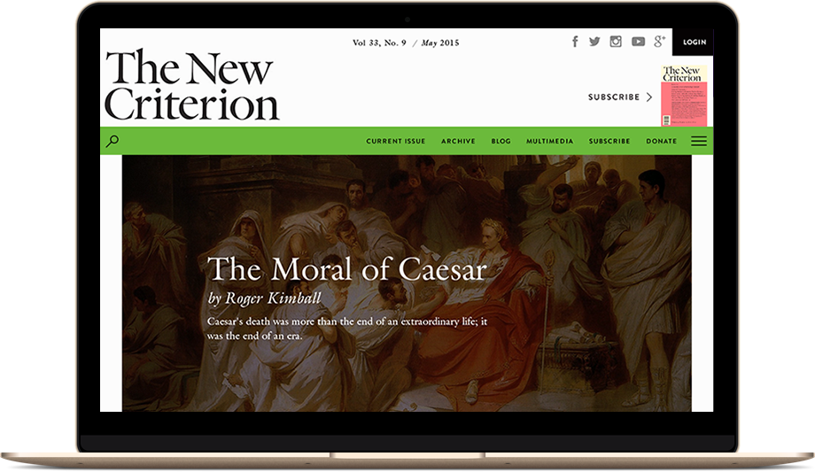
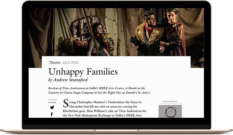
The New Criterion is an esteemed journal that for 35 years has been leveling civilized criticism on the Western world’s arts and culture. Its brand aesthetic matches the editorial content it surrounds: smartly dressed, well-informed, and classically charming. The printed edition is the crown of the brand, the summation of its unwavering visual identity, primarily in the usage of Matthew Carter’s “Galliard” typeface as the house font.

But the journal’s website did not carry the brand’s positive associations. Digital subscriptions had plateaued, and monthly traffic was steadily declining. The New Criterion’s leadership decided it was time to get serious about their on-screen presence, making it match the quality of their printed edition.

“When we turned to the design of a new website for The New Criterion, we determined to make it even more like the magazine in print,” wrote James Panero, Executive Editor, at The New Criterion to us when recapping the project. “It was a mandate that went against all conventions—if there really are such conventions—of "proper" internet design, where every bell and whistle must be deployed to hold the attention of the distracted online reader. But just as The New Criterion dispenses with such frills in print, so too, we determined, would our new site.”

The direction was set, but after an unsuccessful engagement with a DC-based agency where the main complaint was the time it took to iterate and the tone deafness to the magazine’s brand legacy, The New Criterion became aware of the need for a more collaborative approach to seeing that vision come to fruition.

Beck & Stone understood and executed the concept brilliantly, from securing our unique print fonts to finding ways to reproduce the texture and feel of the magazine in a flawless, dynamic site.

Beck & Stone's Austin Stone James Panero, The New Criterion
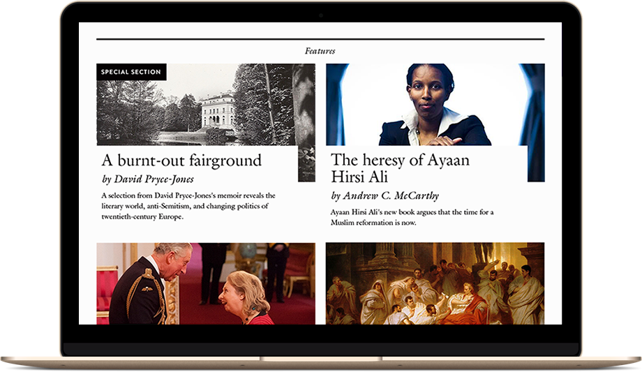
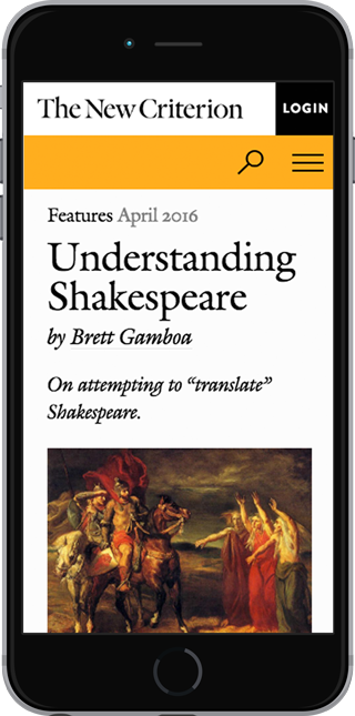
The New Criterion website

Collaborative Design Leads to Rapid Development

Using an HTML prototype with production-quality code, we worked with The New Criterion in an agile development process that minimized the reliance upon mockups that often require more “tell” than “show.”

Giving the client the ability to not only see a design, but have it adapt to the device of their choosing and respond to their interaction is becoming an intrinsic part of the web development process. During a build you have a myriad of professionals at the agency and with the client who all have unique and valuable perspectives to contribute. Objectivism must then become paramount.

Mockups were not done away with completely, however. There is still a place for static representations of interfaces in the development cycle.

An interface’s appearance, especially in editorial design, is arguably the most vital aspect of the publication’s branding online. At the beginning of a tear-it-all-down redesign, or whenever a visually complex idea needs to be demonstrated, wireframes, mockups, pencil drawings, are all fair game. ‘Whatever works’ is what matters, but what works best is the actual code. The quicker you can start expressing yourself in the code, the better for everyone.

The New Criterion’s product owners (the publisher and editors) were presented with key mockups: an article page and the homepage to establish the visual style and general layout. Further edits, alternate versions, new modules, and even whole templates were designed entirely in the browser.

Work sped up. The client team felt empowered in the decision making and informed on the progress. “We couldn't have been more pleased with the fascinating process and Beck & Stone's sensitivity to our particular vision,” said James Panero—and that means a lot to me. That is what a process is for: to make the clients feel like they are involved not just in downloading infromation to you and months later seeing a website, but to have them make the journey of creation with the agency team.

Reading & Curation

The Embedded Project Leader

Process helps, but the agency structure is what makes the process run smoothly.

An enterprise-level publishing site is more than what you can scroll and click through. You need to work with the logistics of publishers: fulfillment houses, customer service, gated content, and migration of archives. Communicating with vendors and getting vendors to cooperate is vital to building a successful product, or you will have a pretty new design that is still a headache for the staff who will be managing it day-to-day.

An editorial website must be built to cater to the casual reader as well as the dedicated subscriber. To meet the needs of the staff member managing it daily and the board who oversees the brand.

Having a technical lead embedded in the client’s organizational structure is key, from the planning and design stage all the way to QA and post-launch support.

It is vital for the lead to approach the site build from every viewpoint: subscriber, donor, staffer, board member, and vendor. It is a high-pressure role that a publisher is not prepared to fill when they set out on a redesign, but one that most web design agencies don’t want to think about or deal with either.

Niche publishers’ concerns about committing to digital transformation strategies revolves around the return on the investment. But time and again we see subscriptions, advertising, and donations spike once that commitment is proven.

Beck & Stone's Austin Stone Austin Stone, Beck & Stone
The New Criterion website

The Results and the Future

An enterprise-level publishing site is more than what you can scroll and click through. The New Criterion was received with great joy by its current subscribers, who received complimentary access to the online archive, PDF downloads of past issues, and an iPad edition of the most recent issue. Austin was onsite at their office on launch day coordinating with the development team and monitoring customer service channels for a smooth, issue-free transition.

The New Criterion Launch Day
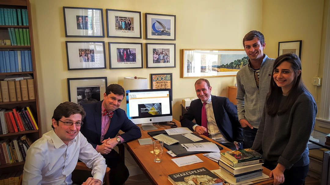
Austin Stone with The New Criterion staff on launch day.

Subscribers were delighted with the experience, and wrote to the client expressing their approval:

This is the finest web site I have ever seen. I first read about it last night in James Panero’s reflections in the latest Friends Report. What a great way to greet this new day, browsing through exquisitely presented material, both print and graphic.
Coming from a bookish and art background, I've always felt the internet to be aesthetically challenged. But your design for newcriterion.com blows my prejudice away. You have made the presentation meet and complement the content at the highest level. I think Hilton Kramer would be ecstatic at the result.
I am first and always a lover of the printed page. And yet you have convinced me that a web site with a digital version of my favorite journal can actually be very beautiful and a great boon and not in the least way annoying!
I’ll never give up that great beauty, the printed version of The New Criterion, and I hope you won’t either. But thank you for this magnificent publishing accomplishment: it provides much to read and enjoy in between the arrivals of your eagerly awaited journal issues.

Within three months from its new launch, the website had added over 100 new digital subscribers and has experienced steady growth in organic and social referral traffic ever since. &

Provide premium content, create a premium experience, and users will pay for premium access.

Beck & Stone's Andrew Beck Andrew Beck, Beck & Stone

Speak to the present.
Listen to the past.
Build for the future.
Let’s do it together.

Contact Us

A brand consultancy driven by design.

  • LinkedIn Twitter

Copyright 2020 © Beck & Stone, Inc. All rights reserved. All opinions expressed in the articles are of the author. Case studies are advertisements and not guarantees of results.